Ever walk into a room and feel something shift inside you? Maybe your shoulders relax. Maybe you feel instantly more alert. That’s not magic, it’s color. And if you ask us, it starts with what’s under your feet: the tiles.
At Cavastone, we believe your floor shouldn’t just be practical. It should spark emotion, reflect your style, and set the tone for your entire home. So let’s talk tile colors, mood-setting palettes, and how to make your home feel as good as it looks.
Key Takeaways
- Tile color affects the mood and energy of your space through color psychology.
- Cool neutrals create calm, open, and relaxing environments.
- Warm earth tones bring comfort, coziness, and a natural feel.
- Bold colors and mosaic tiles add personality and visual interest.
- The right tile color reflects your personal style and enhances your interior design.
Why Tile Color Is a Bigger Deal Than You Think
Sure, tile is durable. It’s easy to clean. It can handle the chaos of muddy shoes, running kids, and the occasional red wine spill. But here’s the secret: your tile is also a storyteller.
This is where color psychology comes into play. The colors that surround us influence how we feel, how we think, even how we behave. [source]
For example, warm tones like beige and terracotta can make a room feel cozy and comforting. Cool tones like pale blue or soft gray bring calm and clarity. Bold shades like deep red or navy can energize a space and boost creativity.
Your tile color sets the emotional tone of a room before you’ve added a single piece of furniture. From the bathroom floor to your kitchen backsplash, these shades help shape how you experience your home, day in and day out.
At Cavastone, we don’t just think about what looks good, we think about what feels good too.
“Tile isn’t background. It’s the base note of your home’s energy. You feel it every time you step into a room.” — The Cavastone Team.
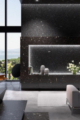
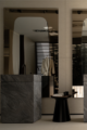
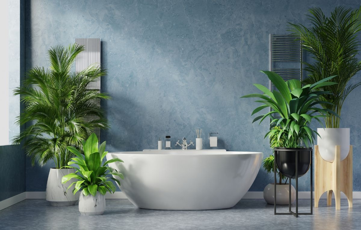
Feeling Calm? Start With Cool Neutrals
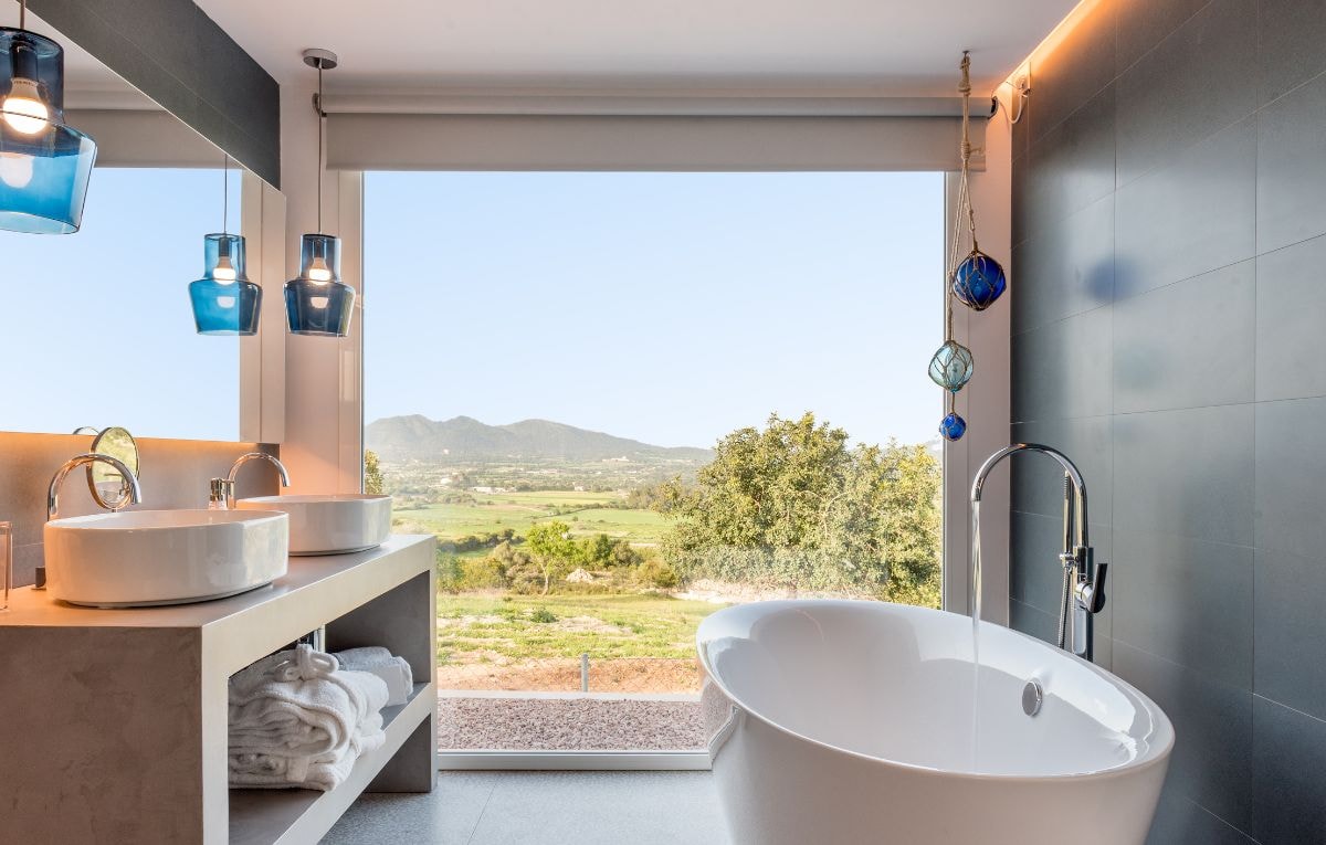
Let’s be honest. Sometimes, you just want a space where you can exhale. That’s where cool neutrals shine.
Soft gray, pale blue, misty beige, and classic white tiles create the kind of spaces that whisper, “take a breath.”
These hues reflect natural light, expand your space, and feel endlessly soothing, especially when paired with matte finishes and fewer grout lines for that clean, seamless look.
Where we love them most:
- Spa-style bathrooms with candles and calm vibes
- Minimalist open floor plans
- Bedrooms where peace and quiet are the priority
Add a touch of texture with large-format tiles or introduce organic charm with natural stone. These colors create balance and harmony without overwhelming your personal aesthetic.
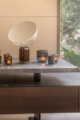
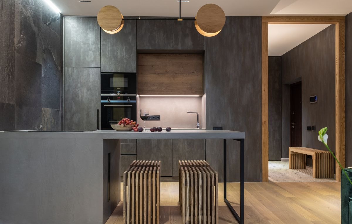
Craving Coziness? Embrace Warm Earth Tones
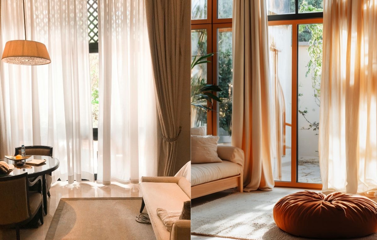
There’s just something about warm earth tones that makes us want to curl up with a cup of tea and a good book. Think rich brown, golden sand, warm beige, and soft terracotta.
These neutral tones are the secret to homes that feel lived in, loved, and ready to host the whole family on Sunday. Pair them with wood, leather, or linen, and your space instantly feels grounded and welcoming.
Perfect for:
- Living rooms full of throw pillows and warm lighting
- Entryways that say “come in, stay awhile”
- Kitchens where everyone gathers, even when you tell them dinner’s not ready
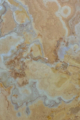
Want more depth? Mix in unique veining from marble tiles or try geometric shapes in porcelain tiles to keep things interesting without clashing with your color scheme.
A Little Nature, A Lot of Peace: Blues and Greens
Blue isn’t just blue. It’s sky, sea, and freedom. Green is growth, calm, and a subtle wink to the outdoors. Together? They’re unstoppable.
We’re talking dusty blue backsplashes, sage ceramic tiles, and ocean-inspired mosaic tiles that make even your laundry room feel like a mini vacation.
Top picks for these tile colors:
- Tranquil bathrooms with pale blue tiles and white accents
- Outdoor spaces where nature meets style
- Mudrooms or breakfast nooks that need a little pop of personality
Go for a full feature wall if you’re feeling bold, or sprinkle these different shades in as accents if a subtle look is more your style.
Ready to Make a Statement? Bold Is Beautiful
Not all heroes wear capes. Some show up in deep red tile or dramatic navy geometric shapes. If your personal aesthetic leans confident, creative, or just plain fun, bold tile colors are your best friend.
Don’t be afraid to play here. These colors take center stage, so let them steal the show.
Where to go bold:
- Jewel-toned porcelain tiles in the guest bathroom
- A rich, moody floor in your living room
- A pop of color behind open shelving in your kitchen
Hot tip: Use darker grout with bold tile for serious drama and to hide stains if you’ve got heavy foot traffic.
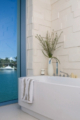
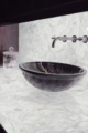
Best Tile Colors for Bathrooms

If we had a dollar for every time someone said, “I want my bathroom to feel like a spa,” we’d be soaking in a hot tub by now. And guess what? Tile color is how you get there.
Go with white tile for brightness. Add pale blue or cool gray for a calming effect. Try a touch of beige for warmth. Mix in mosaic tiles for a little personality, and suddenly you’re not just brushing your teeth, you’re vibing in your very own spa.
Design tips to keep in mind:
- Fewer grout lines create a cleaner look and are easier to maintain
- Match grout color to your tile for soft transitions
- Use natural stone tiles to bring a natural feel into your morning routine
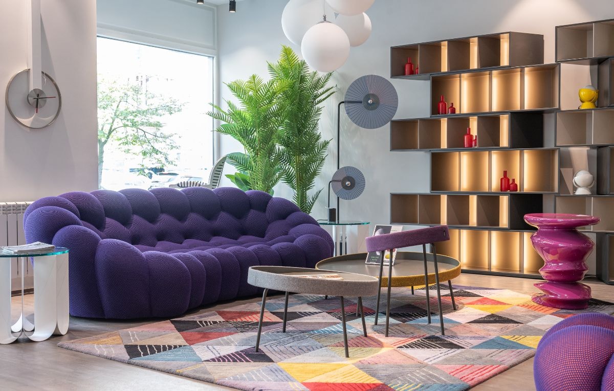
Best Tile Colors for Living Rooms

The living room isn’t just a place. It’s where you make memories. It’s movie marathons, dance parties, board game nights, and sometimes actual living. That’s why tile selection here matters big time.
Top living room tile choices:
- Warm and cool neutrals to match any style
- Natural stone tiles for rustic charm
- Ceramic tiles with matte finishes for low-key luxury
Want to spice it up? Try accent walls in bold colors or create visual interest with patterned porcelain tiles.
The right tile color anchors your room without stealing the spotlight from your couch, rug, or that oversized fiddle leaf fig you keep forgetting to water.
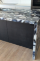
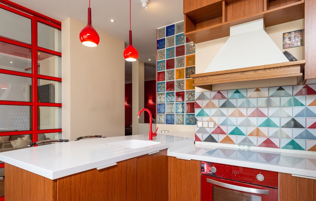
Best Tile Colors for Kitchens

The kitchen is where the magic happens. It’s where meals are made, coffee is poured, and everyone inevitably gathers. Your tile colors should feel just as warm and inviting as the smells coming from the oven.
Favorite kitchen tile combos:
- Beige and soft brown for classic comfort
- Dusty blue and white for a fresh, modern style
- Warm gray or terracotta for rustic elegance
- Deep red mosaic tiles for bold backsplashes that wow
Whether you choose natural stone or ceramic tiles, remember that kitchens deal with heavy foot traffic, spills, and heat. So choose colors that hide stains, feel timeless, and add warmth to your cooking space.
Grout color matters too. Lighter grout brightens the space, while darker grout can add contrast and hide wear.
Best Tile Colors for Bedrooms
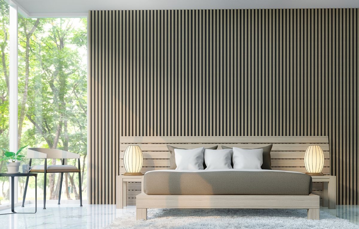
Bedrooms are our sanctuaries. It’s the one room where you can truly unplug. That means your tile choice should reflect rest, relaxation, and comfort.
Soothing tile color ideas:
- Cool neutrals like light gray, soft beige, or pale blue to promote relaxation
- Warm neutrals like taupe and sandy tones to add warmth
- Natural stone with unique veining for a grounded, earthy feel
Want to add visual interest without going bold? Use geometric shapes in a neutral color palette or add texture with matte finishes.
If you’re a fan of barefoot mornings with a cup of coffee, you’ll love the gentle, calming energy of the right tile color underfoot.
Pulling It All Together: The Harmonious Color Palette

Let’s talk harmony. No, not the singing kind. The kind that happens when your floors, walls, furniture, and tiles all get along.
Here’s how to create a harmonious color palette:
- Let your tile color complement your existing colors, not compete
- Use neutral tones in open spaces for flow
- Play with grout color to blend or contrast
- Think ahead to the other elements in the room, like countertops and cabinetry
The goal is to make every room feel intentional and connected, not like a patchwork quilt of Pinterest boards.
A Word on Texture, Finish, and That Extra Spark
Texture is the backbone of great design. It’s what makes a room feel layered and inviting. When you pair the right tile color with the right finish, you unlock next-level style.
Your finish options:
- Glossy finishes reflect light and make colors pop
- Matte finishes soften the mood and feel elegant
- Textured tiles create depth and add character
Layer in visual interest through veining, geometric shapes, mosaic tiles, or by mixing large-format tiles with smaller formats.
These choices make your space more than just beautiful, they make it feel alive.
Choosing the Right Tile Color: Let’s Break It Down
Feeling inspired? Great. Feeling overwhelmed? Also totally normal.
Here’s a quick checklist to keep you grounded:
- What mood do you want in each room?
- How much natural light do you get?
- What kind of foot traffic does the room get?
- Are you bold, minimalist, or somewhere in between?
- What colors are already in the room?
And if in doubt, get samples. Lay them out. See how they look at different times of day. Trust your gut. It’s your home, after all. When in doubt, contact our expert team for advice.
Cavastone’s Favorite Color Combos
| Space | Color Combo | Why It Works |
| Bathroom | White tile + Pale blue | Clean, spa-inspired, refreshing |
| Living Room | Taupe + Dusty blue | Cozy, modern, and calm |
| Kitchen | Beige + Deep red mosaic | Warm, bold, and welcoming |
| Bedroom | Light gray + Natural veining | Soft, tranquil, and soothing |
| Outdoor Area | Gray + Sage green stone | Nature-approved and weather-ready |
| Entryway | Brown + Charcoal geometric shapes | Durable and dramatic for high traffic areas |
Summary
We get it. Tile can feel like a big decision. But here’s the truth, your tile color doesn’t just change how your space looks, it changes how it feels. Whether you want calm, bold, earthy, or bright, it’s all possible with the right tile.
And with Cavastone, you’ve got a partner who cares as much about the feel as the finish.
So go ahead, let your floors speak your style. Let your bathroom become a breath of fresh air. Let your kitchen feel like the heart of your home. Let your bedroom give you the peace you deserve. And let your personality shine, one gorgeous tile at a time.
Because when you find the right tiles, it’s not just about flooring. It’s about creating a home that finally, beautifully, feels like you.
Ready to Transform Your Space?
Your perfect tile color is waiting to be discovered. Whether you want calming cool neutrals, cozy warm earth tones, or a bold statement that takes center stage, we have the tiles to bring your vision to life. Explore our collection, find the shades that match your personal aesthetic, and let’s create a home that feels as good as it looks.
Contact our team today and start your color journey.
Frequently Asked Questions
How do I choose the right tile color for my space?
Start by thinking about how you want the room to feel. That’s where color psychology comes in. For calm, go with soft blues or grays. For warmth, try earthy tones. Bold color selection like deep reds or greens can energize a space. Ultimately, your personal preferences and your home’s overall aesthetic should guide your choice.
Are some tile materials more durable than others?
Yes! While all Cavastone tiles are built to last, materials like ceramic tiles and natural stone tiles are incredibly durable, especially in high-traffic areas like kitchens, hallways, and living rooms. These options handle daily wear and tear without compromising on beauty.
Can tile colors affect my home’s interior design style?
Absolutely. Your tile color selection plays a huge role in shaping your interior design. Light neutrals with clean lines work beautifully in minimalist or Scandinavian styles. Warm, textured tones complement rustic or Mediterranean looks. Bright or bold different colors can bring a contemporary or eclectic space to life.
How can I make sure my tiles match the rest of the house?
Choose a color palette that complements the overall aesthetic of your home. Look at the existing colors of your walls, furniture, and fixtures. Using neutral tones is a great way to create flow between rooms, especially in open-plan layouts. Need help? Cavastone’s design team can guide you through your color selection with expert advice.
Are colorful tiles hard to maintain?
Not at all. Whether you choose bold hues or soft shades, the finish and quality matter more than the color itself. Our tiles are incredibly durable, stain-resistant, and easy to clean. Just be sure to select the right grout color and finish to maintain those clean lines and keep your space looking polished.

Owner, Cavastone Group
With years of perseverance and pride in what we do we have become a very well known and positioned company in the Architectural and Design industry. The same perseverance, pride and attention to detail that made us become who we are, are the same qualities we strive to provide to all our customers.